Tuesday, 19 March 2013

Looking back at your preliminary task, what do you feel you have learnt in the progression from it to the final product?

In the progression to my final product, I have become more comfortable with the tools in Photoshop. I have included a lot more technical aspects to my main task and paid more attention to detail than previously. For example one of the things I really like about my front cover was the newspaper background I took pictures of my model in front of. However, I wanted to make it less sepia and stand out as a white and black background, to do this I used the ‘quick select tool’ to select only my model and turned only the background black and white. The effect this gave was to make my model stand out more as the main effect of this contrasted and made her appear more vibrant. I have also learnt the process in which to correct the models skin – making it appear much more flawless and professional, I didn’t pay much attention to this in my preliminary task. I also took more consideration in my photographs, for example I thought about the lighting, angles and how it would look as a final product.

I am much more familiar with the conventions of a magazine; in the preliminary task a bar code was too big and was is the right hand side of the page, the date of the issue was in the left hand corner instead of a conventional masthead, a teasing contents, splash or puff took too much attention away from the main article and image along with clear main cover lines, the numbers for the pages were not clear and the content was not conventionally listed neatly down the page. I also didn’t relate the contents to my main cover I the preliminary task. I followed the majority of magazine conventions on my music magazine products to ensure an effective, professional look. When creating my contents page I decided I wanted more pictures as contents pages conventionally include a variety of images so I decided to do another photo-shoot. I did take more images or Lauren, the model on the cover, and even though I liked them I decided not to use them as magazines don’t conventionally over use one person throughout a magazine. Therefore I use a picture of another person, of the opposite sex for variety, with a guitar so I could advertise a ‘prize giveaway’ (another convention of magazines)

As well as this, by collecting audience feedback on my first draft contents and front pages of my music magazine products, I was able to refine, take away and improve my products with the approval of my target audience– by hearing from the audience directly it helped me to understand what they would prefer to see on my products and which style they enjoyed the most. By also using my teacher opinion into consideration helped me create a more professional looking final product. I don’t feel like the images in my preliminary link as well with the products as effectively as the music magazine images do – the dominating, close-up front cover image seems to directly address the audience much more effectively as well as the use of costume representing and addressing the alternative genre audience. I feel I tried to do this in my preliminary task but I don’t think it would of appealed to my target audience of college students as effectively.

What have you learnt about technologies from the process of constructing this product?
Alot of the process creating my mgazine was done in photoshop these are the basic toold i used a lota nd found helpful:
 
I used adobe Photoshopt to edit and develop my image into a magazine. However, after editing my images i used microsoft publisher for my double page spread. i spent a lot of time perfecting my front cover image.
To create this image for my front cover I first used the spot removal tool to remove all of my model’s blemishes. Earlier in my blog i ahve shown the methods on photoshop I used to create the flawless and tanned effect on the skin. 
Firstly i used the magic wand to select all the skin I then made a copy of this layer and called it ‘skin’. I then made two copies of this – just her skin. On the first copy I used the Gaussian blur tool on 10 pixels to blur the skin and darkened this copy using blending options. I then lightened the second copy using the same tool and turned the background back on. Using the eraser tool I was able to carefully erase the lips, teeth and eyes and small heart on the cheek of my model – this way they appeared in focus while the rest of her skin remained blurred. After merging all of the layers together, I used the overlay tool to add the glow. I also slightly stretched the images vertically to make my model look taller and slimmer.
 
How did you attract/address your audience?
The price of my magazine is at £3.00  this could be considered quite expensive when attracting an audience mostly consisting in the E category demographically. However, the fact that the magazine is being produced monthly, I feel this price is acceptable as it equal out to under £1 a week this also ensures reasonable printing quality.
I tried to make my main artist  appeal to my target audience of old teenagers, I did this by creating a proffisional looking magazine to attract young adults whilst also making the content thing they would be interested in eg. festivals, new albums, your dates ect. On the front cover my model is looking directly into the camera addressing my audience as they may feel the artist represents them in this way or they can aspire to the artist. It also entices the reader in as she is making direct eye contact.

I created a questionaire and asked 10 people what they thought of my magazine these are the results

Demographics prezi


Monday, 18 March 2013

Conventions and Social Groups

How does your media product represent particular social groups?
With the genre of my magazine being alternative, my target audience could be seen as being represented rebellious within my products. Stereotypically, the ‘alternative’ audience are those who enjoy non-mainstream music and that of alternative bands that are not in the mainstream charts. My front cover image and double page spread image show that of an artist who is conquering the world, and perhaps 'breaking out of the norms of mainstream music, the poses in my images suggest confidence and ‘rebel’ behaviour (facial expressions, outfit, hairstyle). Due to this, the alternative genre audience are therefore represented in a reckless way – their music taste is of their own and they are confident about their interests. Teenagers (who are my main taregt audience) may look for a magazine exuding confidence as they lack it themselves.
As well as this, the teasing contents on my front cover effectively represents a British alternative magazine by involving the British festival, Leeds fest. This establishes the British audience as well as the festival effectively representing the alternative genre by reflecting their music taste (typically).
I think my product best represtnt those in the E/D demographic however the rebellious attitude that comes across in my products may not effectively represent their attitudes as people.


What type of media institution might distribute your media product and why?
For my magazine I feel that Century one publishers would be the most appropriate institution to distribute my media products. In my research, I found that they do not seem to have any other alternative music magazines published, instead mainly target fashion magazines. This would mean my magazine would attract an entirely new audience for them and my magazine would have no major competitors within the same institution fighting for the same audience. In fact any magazine publishing company, that does not already distribute an alternative music magazine, would benefit from my magazine. By only having one gernre of magazine you are not in competition with yourself. Both Q magazine and Kerrang! magazine are published by Bauer Media; due to having a similar target audience, Bauer Media may not benefit from my magazine because mine and Q/Kerrang! magazine are competitors so will not attract entirely different audiences therefore not as much business for the institution. As well as this, my magazine only attarcts a niche audience and there is no room to expand and have variations of the same thing.

Friday, 15 March 2013

Evaluation

In what ways does your media product use, develop or challenge forms and conventions of real media products?
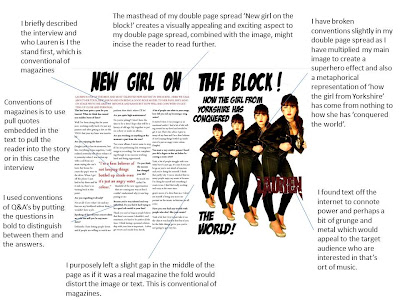
My music magazine uses conventions of a real magazine for example they have continuity of colour through the front cover, contents and double page spread creating a house style of red, white and black. This is conventional of magazines as you can usually link back a double page spread advertised on the front cover. They all have this continuity so they look like they would belong together in a magazine. Even though I’ve tried to create similarities between them I also wanted to make them visually appealing and exciting to read. For example the heading on the double page spread ‘new girl on the block!’ I did in a comic book font; I felt this would appeal to the readers as a lot of the magazines target audience would be interested in comics, as seen in my reader profile.

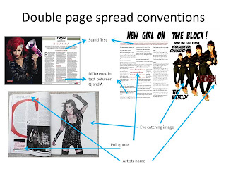
My magazine matches conventions of real media product music magazine because of simple things like the page number on the contents matching my double page spread and the same artist on the cover being carried through the magazine. I have challenge conventions by using bold colours that are not in the house style, in my contents page, I did this to make the ‘join the band’ feature stand out. This is not conventional in the fact that every magazine does this in this way; however magazines frequently break their house style to advertise things that are important to the magazine. In the double page spread I have followed conventions with pull quotes larger than the text imbedded in the text , pictures of the artist on the cover and a large heading describing the story the top of the page.