In
what ways does your media product use, develop or challenge forms and
conventions of real media products?
My music magazine uses conventions of a real magazine for
example they have continuity of colour through the front cover, contents and double
page spread creating a house style of red, white and black. This is
conventional of magazines as you can usually link back a double page spread
advertised on the front cover. They all have this continuity so they look like
they would belong together in a magazine. Even though I’ve tried to create
similarities between them I also wanted to make them visually appealing and
exciting to read. For example the heading on the double page spread ‘new girl
on the block!’ I did in a comic book font; I felt this would appeal to the
readers as a lot of the magazines target audience would be interested in
comics, as seen in my reader profile.
My magazine matches conventions of real media product music
magazine because of simple things like the page number on the contents matching
my double page spread and the same artist on the cover being carried through
the magazine. I have challenge conventions by using bold colours that are not
in the house style, in my contents page, I did this to make the ‘join the band’
feature stand out. This is not conventional in the fact that every magazine
does this in this way; however magazines frequently break their house style to
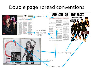
advertise things that are important to the magazine. In the double page spread
I have followed conventions with pull quotes larger than the text imbedded in
the text , pictures of the artist on the cover and a large heading describing the story the top of the page.


No comments:
Post a Comment