Tuesday, 19 March 2013

Monday, 18 March 2013
Conventions and Social Groups
How does your media product represent particular social groups?
With the genre of my magazine being alternative, my target audience could be seen as being represented rebellious within my products. Stereotypically, the ‘alternative’ audience are those who enjoy non-mainstream music and that of alternative bands that are not in the mainstream charts. My front cover image and double page spread image show that of an artist who is conquering the world, and perhaps 'breaking out of the norms of mainstream music, the poses in my images suggest confidence and ‘rebel’ behaviour (facial expressions, outfit, hairstyle). Due to this, the alternative genre audience are therefore represented in a reckless way – their music taste is of their own and they are confident about their interests. Teenagers (who are my main taregt audience) may look for a magazine exuding confidence as they lack it themselves.
As well as this, the teasing contents on my front cover effectively represents a British alternative magazine by involving the British festival, Leeds fest. This establishes the British audience as well as the festival effectively representing the alternative genre by reflecting their music taste (typically).
I think my product best represtnt those in the E/D demographic however the rebellious attitude that comes across in my products may not effectively represent their attitudes as people.


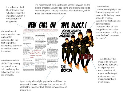
With the genre of my magazine being alternative, my target audience could be seen as being represented rebellious within my products. Stereotypically, the ‘alternative’ audience are those who enjoy non-mainstream music and that of alternative bands that are not in the mainstream charts. My front cover image and double page spread image show that of an artist who is conquering the world, and perhaps 'breaking out of the norms of mainstream music, the poses in my images suggest confidence and ‘rebel’ behaviour (facial expressions, outfit, hairstyle). Due to this, the alternative genre audience are therefore represented in a reckless way – their music taste is of their own and they are confident about their interests. Teenagers (who are my main taregt audience) may look for a magazine exuding confidence as they lack it themselves.
As well as this, the teasing contents on my front cover effectively represents a British alternative magazine by involving the British festival, Leeds fest. This establishes the British audience as well as the festival effectively representing the alternative genre by reflecting their music taste (typically).
I think my product best represtnt those in the E/D demographic however the rebellious attitude that comes across in my products may not effectively represent their attitudes as people.


What type of media institution might
distribute your media product and why?
For
my magazine I feel that Century one publishers would be the most appropriate
institution to distribute my media products. In my research, I found that they do not seem
to have any other alternative music magazines published, instead mainly target
fashion magazines. This would mean my magazine would attract an
entirely new audience for them and my magazine would have no major competitors
within the same institution fighting for the same audience. In fact any magazine publishing company, that does not already distribute an alternative music magazine, would benefit from my magazine. By only having one gernre of magazine you are not in competition with yourself. Both Q magazine and Kerrang! magazine are published by Bauer
Media; due to having a similar target audience, Bauer Media may not benefit from
my magazine because mine and Q/Kerrang! magazine are competitors so
will not attract entirely different audiences therefore not as much business for
the institution. As well as this, my magazine only attarcts a niche audience and there is no room to expand and have variations of the same thing.
Friday, 15 March 2013
Evaluation
In
what ways does your media product use, develop or challenge forms and
conventions of real media products?
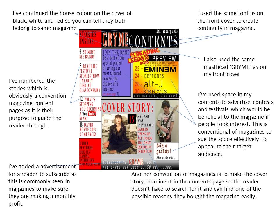
My music magazine uses conventions of a real magazine for
example they have continuity of colour through the front cover, contents and double
page spread creating a house style of red, white and black. This is
conventional of magazines as you can usually link back a double page spread
advertised on the front cover. They all have this continuity so they look like
they would belong together in a magazine. Even though I’ve tried to create
similarities between them I also wanted to make them visually appealing and
exciting to read. For example the heading on the double page spread ‘new girl
on the block!’ I did in a comic book font; I felt this would appeal to the
readers as a lot of the magazines target audience would be interested in
comics, as seen in my reader profile.
My magazine matches conventions of real media product music
magazine because of simple things like the page number on the contents matching
my double page spread and the same artist on the cover being carried through
the magazine. I have challenge conventions by using bold colours that are not
in the house style, in my contents page, I did this to make the ‘join the band’
feature stand out. This is not conventional in the fact that every magazine
does this in this way; however magazines frequently break their house style to
advertise things that are important to the magazine. In the double page spread
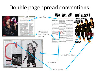
I have followed conventions with pull quotes larger than the text imbedded in
the text , pictures of the artist on the cover and a large heading describing the story the top of the page.




Thursday, 14 March 2013


Monday, 11 March 2013
Contents Page Improvements

In my final improvements of my contents page I have taken all my feedback on board and added a new picture and competition for more variety and content.
Second Photoshoot


Subscribe to:
Posts (Atom)