In the progression to my final product, I have become more comfortable
with the tools in Photoshop. I have included a lot more technical aspects to my
main task and paid more attention to detail than previously. For example one of
the things I really like about my front cover was the newspaper background I took
pictures of my model in front of. However, I wanted to make it less sepia and
stand out as a white and black background, to do this I used the ‘quick select
tool’ to select only my model and turned only the background black and white. The
effect this gave was to make my model stand out more as the main effect of this
contrasted and made her appear more vibrant. I have also learnt the process in
which to correct the models skin – making it appear much more flawless and
professional, I didn’t pay much attention to this in my preliminary task. I also took more consideration in my photographs, for example I thought about the lighting, angles and how it would look as a final product.
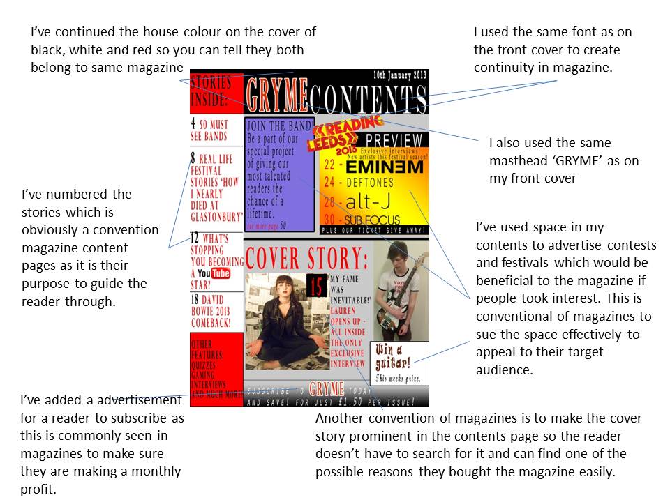
I am much more familiar with the conventions of a magazine; in the preliminary task a bar code was too big and was is the right hand side of the page, the date of the issue was in the left hand corner instead of a conventional masthead, a teasing contents, splash or puff took too much attention away from the main article and image along with clear main cover lines, the numbers for the pages were not clear and the content was not conventionally listed neatly down the page. I also didn’t relate the contents to my main cover I the preliminary task. I followed the majority of magazine conventions on my music magazine products to ensure an effective, professional look. When creating my contents page I decided I wanted more pictures as contents pages conventionally include a variety of images so I decided to do another photo-shoot. I did take more images or Lauren, the model on the cover, and even though I liked them I decided not to use them as magazines don’t conventionally over use one person throughout a magazine. Therefore I use a picture of another person, of the opposite sex for variety, with a guitar so I could advertise a ‘prize giveaway’ (another convention of magazines)
I am much more familiar with the conventions of a magazine; in the preliminary task a bar code was too big and was is the right hand side of the page, the date of the issue was in the left hand corner instead of a conventional masthead, a teasing contents, splash or puff took too much attention away from the main article and image along with clear main cover lines, the numbers for the pages were not clear and the content was not conventionally listed neatly down the page. I also didn’t relate the contents to my main cover I the preliminary task. I followed the majority of magazine conventions on my music magazine products to ensure an effective, professional look. When creating my contents page I decided I wanted more pictures as contents pages conventionally include a variety of images so I decided to do another photo-shoot. I did take more images or Lauren, the model on the cover, and even though I liked them I decided not to use them as magazines don’t conventionally over use one person throughout a magazine. Therefore I use a picture of another person, of the opposite sex for variety, with a guitar so I could advertise a ‘prize giveaway’ (another convention of magazines)
As well as this, by collecting audience feedback on my first
draft contents and front pages of my music magazine products, I was able to refine,
take away and improve my products with the approval of my target audience– by
hearing from the audience directly it helped me to understand what they would
prefer to see on my products and which style they enjoyed the most. By also using
my teacher opinion into consideration helped me create a more professional
looking final product. I don’t feel like the images in my preliminary link as
well with the products as effectively as the music magazine images do – the
dominating, close-up front cover image seems to directly address the audience
much more effectively as well as the use of costume representing and addressing
the alternative genre audience. I feel I tried to do this in my preliminary
task but I don’t think it would of appealed to my target audience of college
students as effectively.